
Image: Foundry
Summary created by Smart Answers AI
In summary:
- Macworld outlines four key improvements needed for macOS 27, including redesigning the confusing System Settings UI and replacing the poorly received ‘Apps’ feature that downgraded LaunchPad functionality.
- Apple is expected to unveil enhanced Siri capabilities and Apple Intelligence integration at WWDC26, aiming to compete with Microsoft’s Copilot and Google’s Gemini AI advances.
- The article emphasizes Apple’s need to maintain macOS’s distinct identity while improving user experience through better AI integration and more intuitive navigation systems.
As a longtime Mac user, I’m actually pretty happy with the state of macOS. All things considered, the Mac is in a pretty good place right now, and while Tahoe has some wrinkles, the platform as a whole is solid. But the key to continued success is continued progression, that the Mac evolve to address the needs of users.
On Monday, Apple will announce macOS 27, the next major version of the Mac operating system, and preview its biggest new features. It’s our chance to see what Apple will do to make our Mac experience better, and here’s what I want to see from macOS at WWDC26.
A lot more Siri
Apple is expected to finally reveal its revamped Siri, and while much of the talk about Siri has been in regards to iOS 27, they carry over to macOS 27, as well. And Apple is expected to show several Apple Intelligence-based features with macOS and its apps.
I’m quite interested in seeing how Apple integrates AI features into macOS, but I’m also interested in the big picture. The ultimate goal with AI development is an AI that knows you almost as well as you know yourself, maybe even better, resulting in a computing experience that maximizes your productivity. Microsoft is attempting to do this with Windows Copilot, and Google recently announced several new Gemini-related technologies that can provide “real work with minimal human input,” according to TechCrunch’s Rebecca Bellan.
As you already know, Apple is behind in its AI development and implementation. Apple has to do two things here: play catch-up and demonstrate that it is making real progress beyond that. My interest is less about new features I can use and more about Apple’s ability to develop and execute technology that will be at the core of everything moving forward.
Square application icons became the norm in macOS Tahoe. Booooorrrring.
Foundry
Visual tweaks
Now, on to more concrete macOS features and products I’ll be looking for at WWDC26. macOS Tahoe introduced Liquid Glass and other changes to the look of the OS–some hate it, some like it. Me, I’m in the middle; I don’t find the changes offensive, but I’m not enthused by them, either.
But there’s one thing clear, and that is Apple is attempting to unify the look of macOS and iOS an much as possible. Since they’re all part of the same ecosystem, this makes sense but in practicality, it sacrifices the uniqueness of each platform. I’m hoping to see efforts to make macOS stand out as well as take advantage of its platform. This includes dynamic widget sizes and hiding, icon tinting, and the ability for developers to create app icons that are unique and not restricted to the iOS-style rounded squares.
System Settings fixes
Speaking of graphical tweaks, the System Settings UI needs more than a graphical makeover. With the current layout, it seems as though Apple wants users to rely on using Search, but the problem is that users don’t know what the settings are called. It needs an organizational reconstruction to make it easier to get to the setting you need. While I’d be happy with a redesign, it would be amazing if Apple figured out how to use Apple Intelligence to make System Settings intuitive.
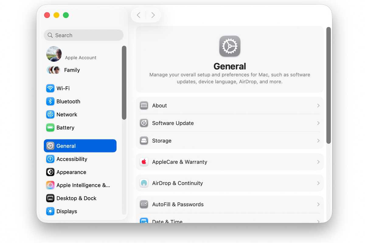
Time for Apple to clean up this mess.
Foundry
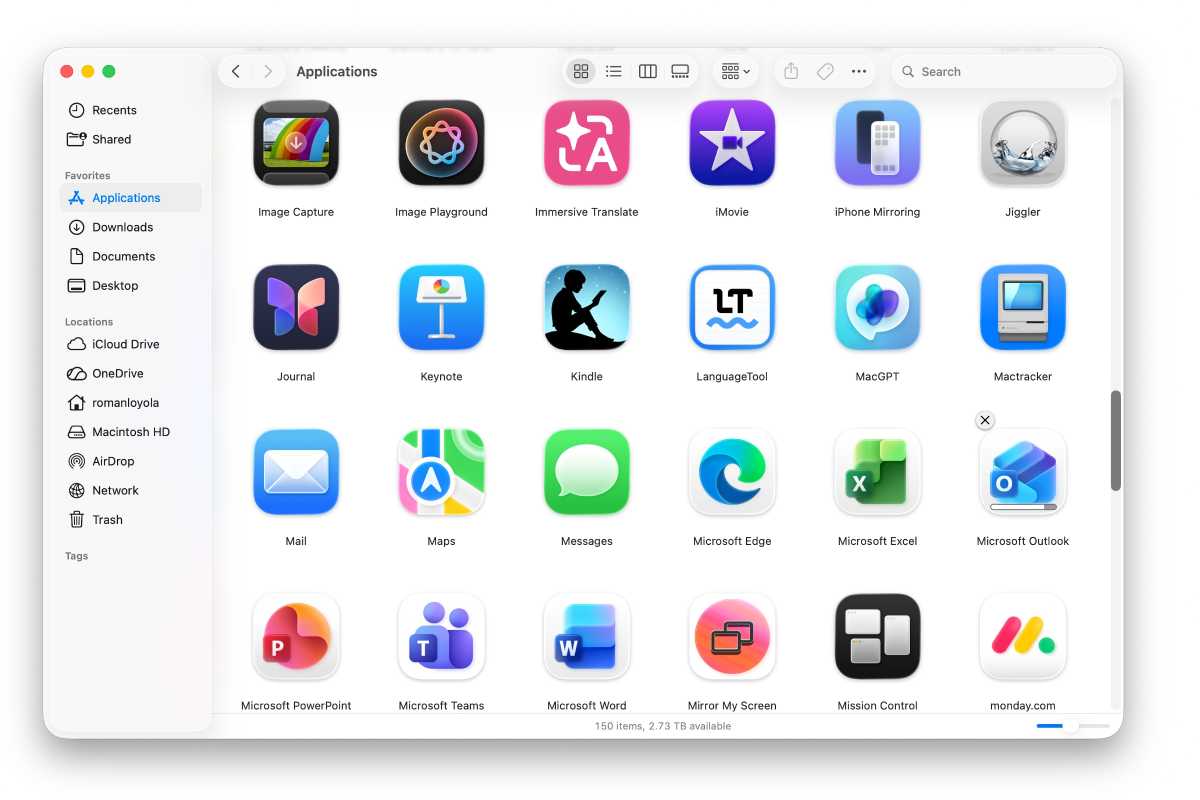
A little more LaunchPad
With macOS Tahoe, Apple wanted to move people from using LaunchPad to using the revised Spotlight. But LaunchPad lives on, in a way; it was replaced by the Apps app. However, Apps is nowhere near as functional as LaunchPad–it feels like a pacifier for LaunchPad users as they practice using Spotlight instead.
Apps don’t have any customization options, their listing options are few, and for some reason, you can’t expand the Apps window horizontally, which would go a long way in its usability. I’m hopeful that Apple will offer Apps UI tweaks in macOS 27, but if they don’t, they should just get rid of it completely–in its current state, Apps isn’t more useful than having an alias of the Applications folder in the Dock.
I’m convinced the Apps app in macOS Tahoe was released to purposely frustrate LaunchPad users like me.
Foundry
Author: Roman Loyola, Senior Editor, Macworld

Roman is a Macworld Senior Editor with over 30 years of experience covering the tech industry, focusing on the Mac and other products in the Apple ecosystem. He is also the host of the Macworld Podcast. His career started at MacUser, where he received Apple certification as a repair technician (when Apple did that kind of thing). He’s also worked for MacAddict, MacLife, and TechTV.
